As a design professional, I can say this is one of the most frequently asked questions (FAQs) when talking to my clients! And therefore, I am so happy to provide you with an easy to follow guideline about how high to position your artwork on the wall. [bctt tweet=”Getting your artwork right is the one design element that can make or break your overall decorating composition” username=”@restyleinterior”]… no pressure of course!
When I look at artwork, the first thing that catches my eye is how it is positioned
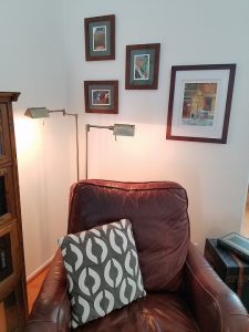
in relationship to the objects around it. Like in this photo here from a past Fast Fix Friday video.
When artwork feels “visually” connected it has a natural flow and feels well balanced in the space. You will notice that the floor lamp is creating the visual connection to the artwork. The collection is laid out on a diagonal which leads your eye up, creating balance with the tall bookcase on the far left. This vignette shouts cozy, reading nook!
This video explains the “visual” connection even further, describing the distance a piece of art should be hung above your furniture.
I hope you found this information helpful, and please feel free to continue to discussion with your comments below. Feel free to share this tip with your friends!
Are you ready to discover how fast and fun it could be
to design a creative space of your own? Check out The DIY Makeover Kit


Leave a Reply